
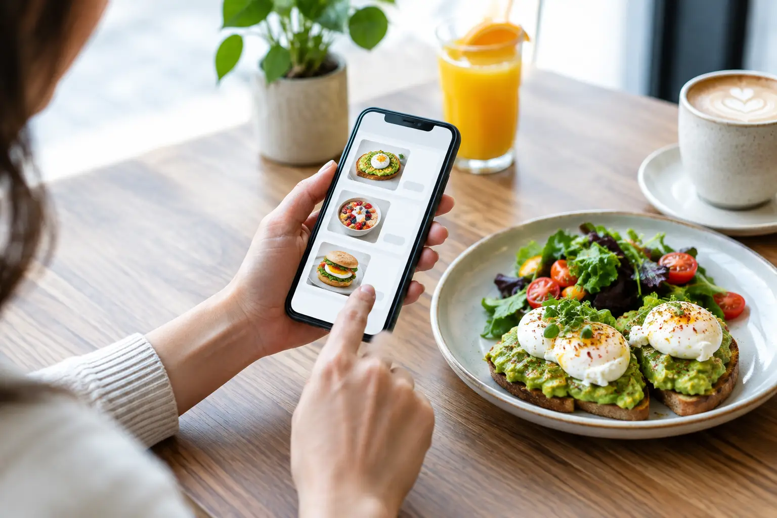
A good online ordering case study is not about flashy software or pretending every breakfast order needs a corporate flowchart. It is about a very familiar moment: you are hungry, your morning is moving fast, and you want the burrito, coffee, smoothie, or vegan bowl you actually want – without a phone call, a guessing game, or a sad pickup counter surprise.
For a neighborhood brunch spot, online ordering has one job: carry the same good energy of the dining room into the part of the day when customers are in slippers, in traffic, between meetings, or trying to feed a whole crew. When it works, it turns convenience into a reason to come back. When it does not, even great food can lose its shine.
The real problem: brunch cravings do not run on a schedule
Breakfast and lunch are wonderfully chaotic. A parent is ordering for the family before school pickup. A remote worker has twelve minutes between calls. A group chat is trying to solve a Saturday brunch plan without creating seventeen new messages. Someone wants eggs and cheese; someone else needs vegan options; someone is asking whether the wrap can be gluten-free.
The old move was calling ahead and hoping everyone heard the order correctly. The slightly newer move was standing in line, reading a menu while your coffee need rose from “would be nice” to “medical necessity.” Neither option is ideal when the food is meant to feel easy, fun, and generous.
Online ordering earns its keep by giving customers control. They can look at choices without holding up a line, select modifications at their own pace, choose pickup or delivery, and get on with their day. That sounds simple because it should be. The trick is making the digital experience feel clear rather than cold.
What this online ordering case study teaches
The strongest lesson is that convenience is not separate from hospitality. It is hospitality, just wearing a different outfit.
At a full-service neighborhood café, a regular may know exactly what they want: the same breakfast sandwich, extra hot sauce, coffee on the side. Another guest may be trying the menu for the first time and needs reassurance that there is a real meal waiting beyond a plain side salad. The ordering experience has to serve both people without making either one work too hard.
That begins with a menu organized around how people think when they are hungry. Breakfast sandwiches belong together. Burritos should not hide among salads. Vegan and gluten-free choices need clear labels, not a scavenger hunt. Coffee drinks and smoothies should be easy to add before checkout, because nobody wants to realize they forgot the cold brew after they have paid.
A digital menu also needs descriptions with a little personality and a lot of useful detail. “Flavorful” is nice. Knowing there is avocado, roasted vegetables, a spicy sauce, or a dairy-free swap is better. Customers are not asking for a novel. They are asking for enough confidence to press “add to order.”
A mixed-diet order should not feel like a negotiation
This matters especially for groups. The person craving a classic egg-and-cheese breakfast should be able to order happily beside the friend choosing a plant-based brunch plate. A family should not need separate restaurants because one person avoids gluten. A team lunch should not become an email chain about who can eat what.
Clear dietary labels reduce friction, but clarity must be honest. If an item can be modified, say what the modification is. If cross-contact may be a concern, communicate that appropriately. If a vegan option is substantial, give it the same pride of place as everything else. Plant-based diners can spot an afterthought from a mile away.
The trade-off is that customization can become a maze. Too few choices can feel restrictive; too many can lead to errors and slow down the kitchen. The sweet spot is offering the modifications people truly request, presenting them in a logical order, and avoiding a build-your-own labyrinth at 8:45 a.m.
The checkout is part of the meal
Customers do not separate the food from the ordering experience as neatly as businesses sometimes do. If checkout is confusing, if the pickup time feels vague, or if a confirmation never arrives, the order already feels less satisfying before the first bite.
A strong order flow answers the questions customers are silently asking: Did my order go through? When should I arrive? Is this for pickup or delivery? Can I add a note? What happens if I need to make a change? Those answers should be visible, not buried beneath tiny text.
Pickup timing deserves special care. Quoting an unrealistically fast time may win a click, but it loses trust when guests arrive to a packed counter and a long wait. A more accurate window is kinder to customers and the kitchen. Brunch is a rush, not a magic trick.
There is a business side here, too. Thoughtful pacing protects food quality. A hot breakfast sandwich that waits too long loses its charm. Smoothies melt into a different kind of science project. Fries, if they are part of the order, have their own opinions about time. Order throttling or realistic prep windows can make a noticeable difference during peak periods.
The handoff has to feel human
Online ordering should not turn a beloved local café into a vending machine with better typography. The pickup moment is still a moment of hospitality.
A clearly marked pickup area helps guests avoid hovering awkwardly near seated diners. Names should be easy to find. Packaging should keep hot and cold items sensibly separated when possible. Drinks need lids that can survive a short ride home. Small details matter because they communicate, “Yes, we thought about how this food gets from our kitchen to your kitchen table.”
For delivery, the same principle applies with more variables. Delivery expands reach and helps on rainy days, busy workdays, and those mornings when leaving the house is simply not on the agenda. But it also introduces platform fees, driver timing, and less control over the final handoff. That does not make delivery a bad choice. It means the menu should favor items that travel well, and customers should receive realistic expectations.
Pickup may be the better fit for a customer who wants the fullest version of the meal, fastest. Delivery may be worth it for convenience. The point is not to push everyone toward one channel. It is to make each option honest about what it does best.
Repeat orders are where the groove begins
A first online order is a test. A second one is a habit forming.
That is why rewards, saved favorites, gift cards, and easy reordering can matter more than a giant discount banner. A loyal customer does not always need to be convinced that the food is good. They need a reason to remember that ordering it again is easy. Maybe it is a points perk. Maybe it is a birthday treat. Maybe it is simply seeing their go-to order waiting in a few taps.
The best repeat-business strategy is still reliability. If the order is correct, the timing is dependable, and the food arrives looking like it was made by people who care, customers remember. Promotions can encourage a visit; consistency gives them a reason to make it part of their routine.
For catering, the stakes rise. Office breakfasts, family gatherings, school events, and weekend celebrations involve more people, more dietary needs, and more ways for a small detail to become a big headache. Online catering inquiries or ordering should make portions, lead times, and menu options understandable. A customer planning for fifteen people wants confidence, not a riddle wrapped in a bagel.
Keep the digital experience unmistakably yours
A clean ordering system does not have to sound like every other restaurant on the internet. A playful note in an order confirmation, colorful menu language, or a friendly pickup instruction can carry personality without getting in the way. The vibe should make people smile, not make them hunt for the “place order” button.
That balance matters for a spot like Stella Blue Bistro, where the experience includes more than what is on the plate. The music, color, community energy, and comfort-food joy are part of why people show up. Digital ordering cannot replace the room, but it can remind customers that their breakfast came from a place with an actual point of view.
Measure what customers are trying to tell you
Numbers are useful when they lead to better decisions, not when they become wall art. Watch which items are frequently reordered, which modifications create confusion, when pickup delays appear, and whether customers abandon their carts at a particular step. Read feedback with an open mind, especially when the same complaint appears more than once.
A popular item that creates repeated kitchen bottlenecks may need a revised prep process or a more realistic availability window. A rarely ordered menu category might need a clearer name, better photo, stronger description, or a gentler goodbye. Not every change requires a full redesign. Often, the useful improvements are gloriously unglamorous: clearer modifiers, smarter category names, better timing, and fewer surprises.
The helpful question to keep nearby is this: would a hungry neighbor feel looked after from the first tap to the last bite? If the answer is yes, online ordering is doing more than moving food. It is making room for one more good morning, one more easy lunch, and one more reason to gather when the moment feels right. ☕
Leave a Reply